Headspace
Revolutionize mental
health for humanity

Project: Design System
Role: Lead Designer
Year: 2021-Present
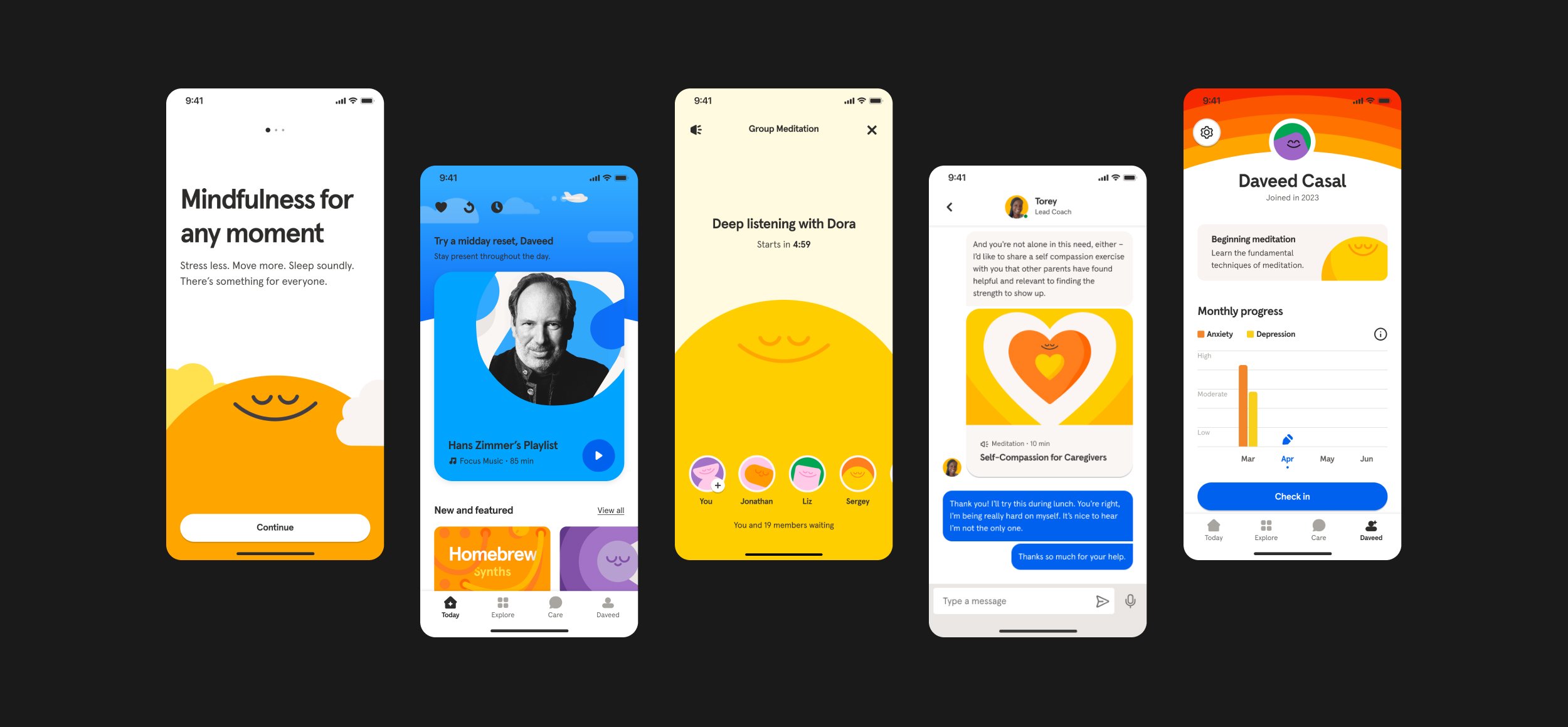
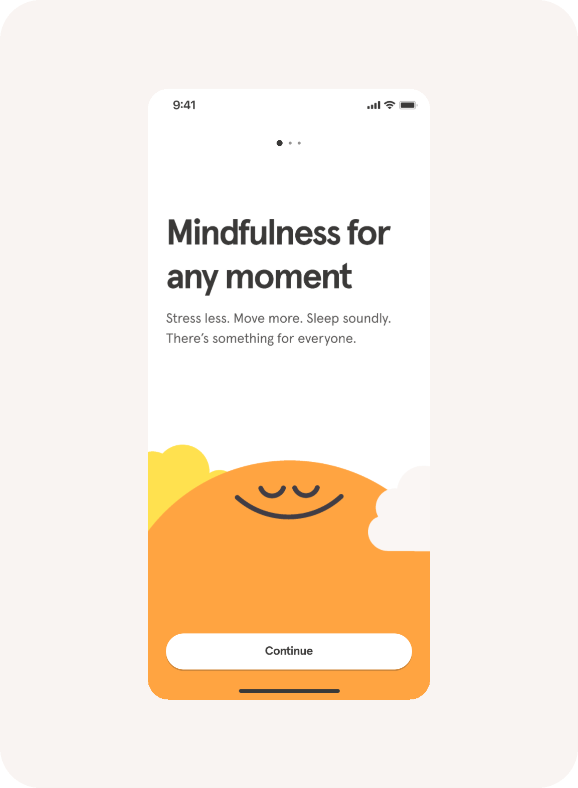
In my role at Headspace, I bridge the brand-product gap by implementing a comprehensive design system. This system ensures a consistent user experience by reflecting the brand's identity through colors, typography, iconography, and layout guidelines. Collaboration with engineering teams and user testing helps refine the system, resulting in a user-centric app experience that enhances engagement and product success.

Color brings the joy
Collaborators: Liz Tran, Karen Hong, Ryan Cox
Our color palette radiates brightness, hope, and accessibility, while embracing a visionary spirit. We distinguish ourselves from the crowd by selecting hues that evoke feelings of joy and freshness, allowing us to beautifully showcase the entire spectrum of emotions.

Emotional
The ‘Emotional’ colors, such as calming blues and greens, bright oranges and yellows, and bold, vibrant hues, represent the brand's core principles of being mindful, encouraging, playful, simple, and proud.

Functional
The ‘Functional’ neutral colors, including whites, greys, and blacks, provide clarity and ease of use for UI elements such as buttons, forms, and typography.

Say hello to —
Headspace Aperçu
Collaborators: David Hsia, Tina Hardison, Lauren Allik, Ken Seeno
In partnership with Colophon Foundry, we embarked on a collaboration to craft a customized rendition of their Aperçu typeface. By infusing playful letterforms with a welcoming touch, we subtly incorporate the graceful curves reminiscent of our iconic smile. These subtle nuances render our proprietary typeface distinct and exclusive to Headspace, while also ensuring accessibility remains a top priority.


Functional
Accessible characters with open apertures resolve mirroring issues and ensure easy distinction.

Friendly
The letterforms evoke a sense of warmth, comfort, and ease through friendly curves.

Playful
We infuse emotions into our expressive marks, like question and exclamation marks, using abstract symbols.

Ownable
The nuances in our typeface make it distinctive and exclusive to Headspace, while also resolving spacing issues encountered with Aperçu.
Icons play a vital role in symbolizing common actions and facilitating navigation within our app. That's why we have meticulously crafted our icons to be bespoke, quirky, rounded, and one of a kind. We never settle for stock icons because we understand the importance of having unique visual elements that truly represent our brand and create a delightful user experience.
Building a foundation that breathes with Headspace
The newly created design token system was developed to seamlessly integrate into the Headspace app's design system, extending its influence to all components and patterns. This comprehensive system not only ensures consistency and cohesiveness but also accommodates the needs of a multi-brand environment.


Optimizing Visual Comfort
Light and dark modes were created, utilizing color tokens to create a visually soothing and calming experience for meditation, while also reducing eye strain and enhancing readability in low-light environments.

Motion-powered guidance
By leveraging our new motion system, we enrich the Headspace app experience, bringing elements to life and providing advanced interactive functionality that encourages exploration and guides our valued members.

Duration
Duration options ensure fluid animations, reflecting tranquility, mindfulness, elegance, context, and complexity.

Easing
Easing curves create smooth and natural transitions, promoting a sense of calmness and tranquility within the member experience.

Patterns
Basic motion patterns create smooth and cohesive animations, enhancing user experience while maintaining simplicity and clarity.

Depth
Depth adds dimension and depth perception, elevating the visual experience and providing a sense of hierarchy, realism, and intuitive navigation.

Dynamic duration
In the Headspace app, dynamic duration is leveraged to enhance the meditation experience. By optimizing motion scales, quick movements are synchronized with shorter distances and smaller objects, resulting in an engaging and harmonious journey for users.
Seamless transition patterns
Transition patterns are thoughtfully employed to facilitate seamless navigation between various screens and states. These patterns ensure a harmonious flow, enhancing user engagement and maintaining a sense of tranquility throughout the Headspace experience.
Building blocks of cohesion
By utilizing these fundamental components, Headspace establishes a cohesive and easily recognizable brand identity, resulting in a unified user experience across the platform.